CG@Penn Rebrand
REDESIGN
MAR 2026
MAR 2026
CG@Penn is the umbrella for the Computer Graphics programs at Penn, within Computer and Information Science.
As part of the launch of a new undergrad program, the CG@Penn student board worked with Penn faculty and marketing to completely overhaul our website and sub-brand within Penn Engineering.
Primary redesign points were to fix a confusing layout of subpages, better highlight student work front and center, and refocus on our main audience of prospective applicants. My role was to lead the redesign and ensure the site could be better maintained, for years to come. Here's how it went!
Primary redesign points were to fix a confusing layout of subpages, better highlight student work front and center, and refocus on our main audience of prospective applicants. My role was to lead the redesign and ensure the site could be better maintained, for years to come. Here's how it went!
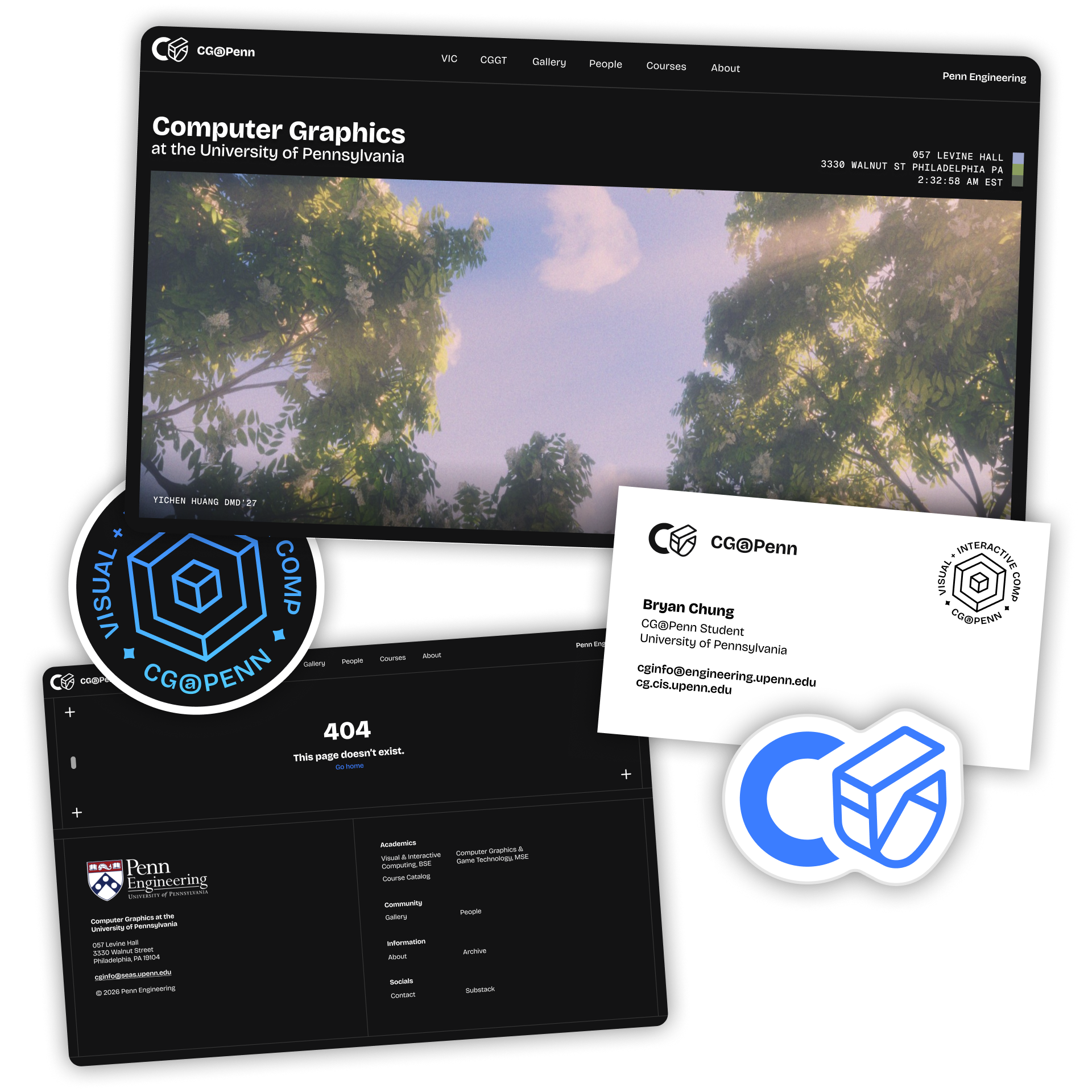
Final pages and product mockups
Redesign Goals
The old site was functional, but weighed down by difficult-to-update collections of student work, as well as the inevitable years of students graduating and leaving outdated info.
The focus of the program had also drifted over time from research.
At the point of the redesign, CG now consisted of an undergrad and graduate graphics degree, with a strong combined student community that I wanted to emphasize.
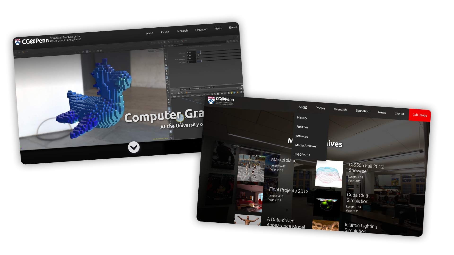
Old homepage with hidden, extraneous sub-tab layouts
Large parts of the old site were also built around informing the existing student body, but our surveys showed that visitors were mostly potential applicants to the program, and the outdated info distracted that audience.
However new students noted that seeing student work highlights was what had motivated them to apply.
From this, my priorities for the redesign were to:
From this, my priorities for the redesign were to:
- Create a standard, reusable grid system that scales well
- Keep student work front and center, as a strong student community, but aim outwardly at our target of prospective students, rather than those already in the program
- Ensure all visual design frames and complements student work (which can vary wildly in style, from 3D to 2D)
- Streamline updating and maintaining galleries and highlight reels
Iteration
Layout and the grid system were tested with wireframes for feedback from faculty and current students, and subsequent iterations focused on simplifying the student work galleries even further, for ease of implementation.
The "widescreen" framing of a student work montage on the homepage was kept through to the final version.
I also designed a new simplified sitemap and user flow, further differentiating between outward-facing student work and the directory. This was based on testing with both new students (who had very recently applied) and alumni who were more used to navigating the old layout, as a way to differentiate our audiences.
I also designed a new simplified sitemap and user flow, further differentiating between outward-facing student work and the directory. This was based on testing with both new students (who had very recently applied) and alumni who were more used to navigating the old layout, as a way to differentiate our audiences.
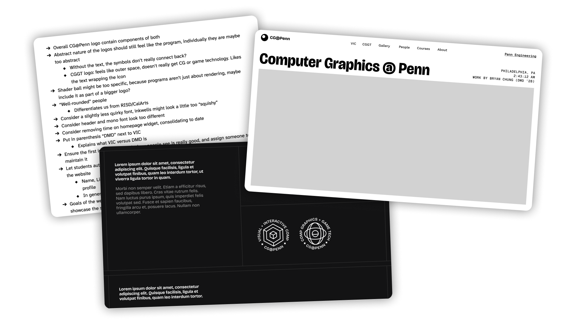
Early layout and grid system tests, with faculty notes
Branding also went through significant iteration with multiple rounds of feedback, where my main goals were to evoke the larger Penn brand while staying distinct, and (obviously) to retain clarity at scale and in a variety of placements.
A specific core concept to our brand I discussed was a fusion of technical (wireframe logo, 3D models, graphics) and creative (pencil, shaders) to represent our student interests.
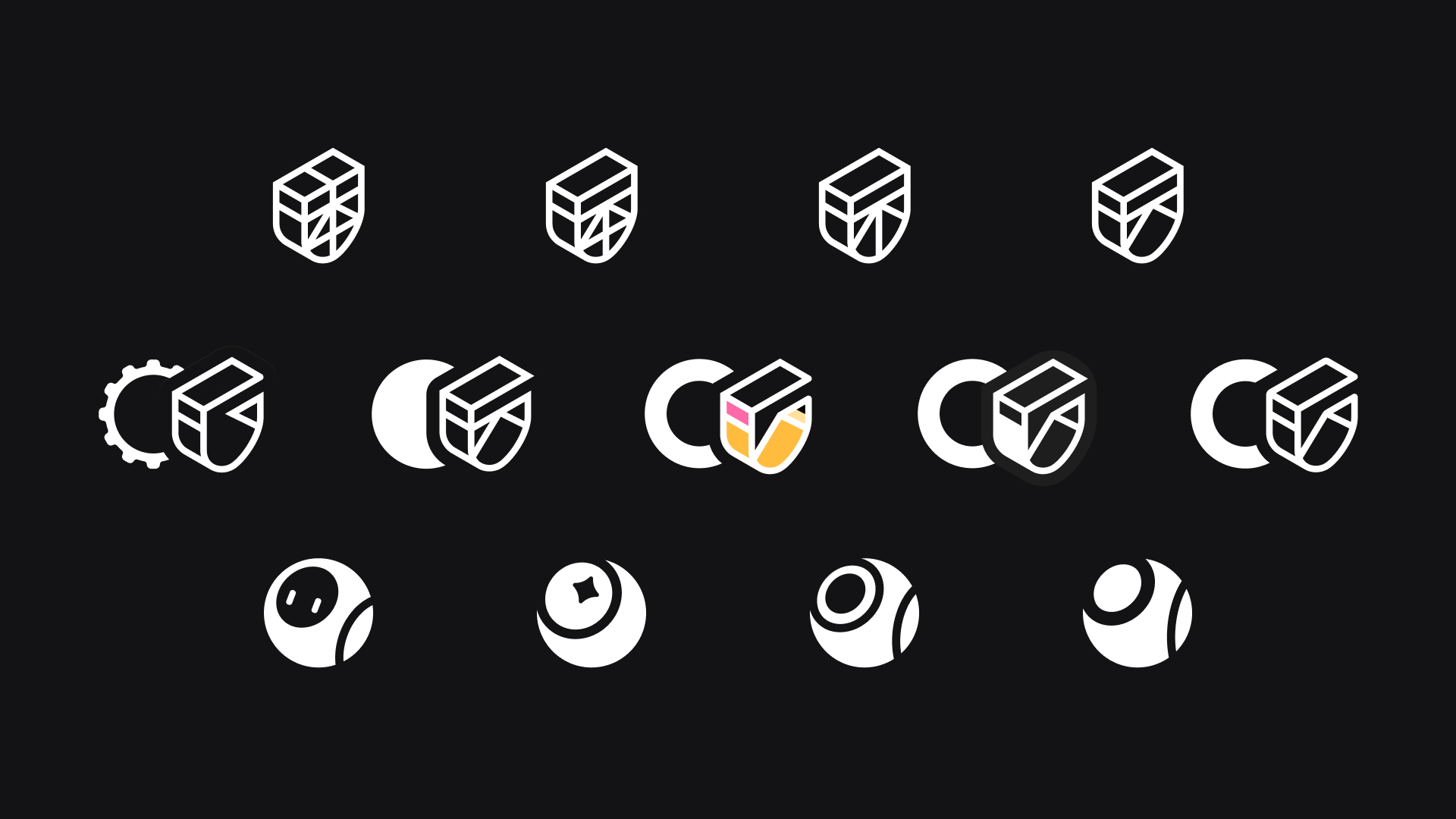
Logo iteration
Finals
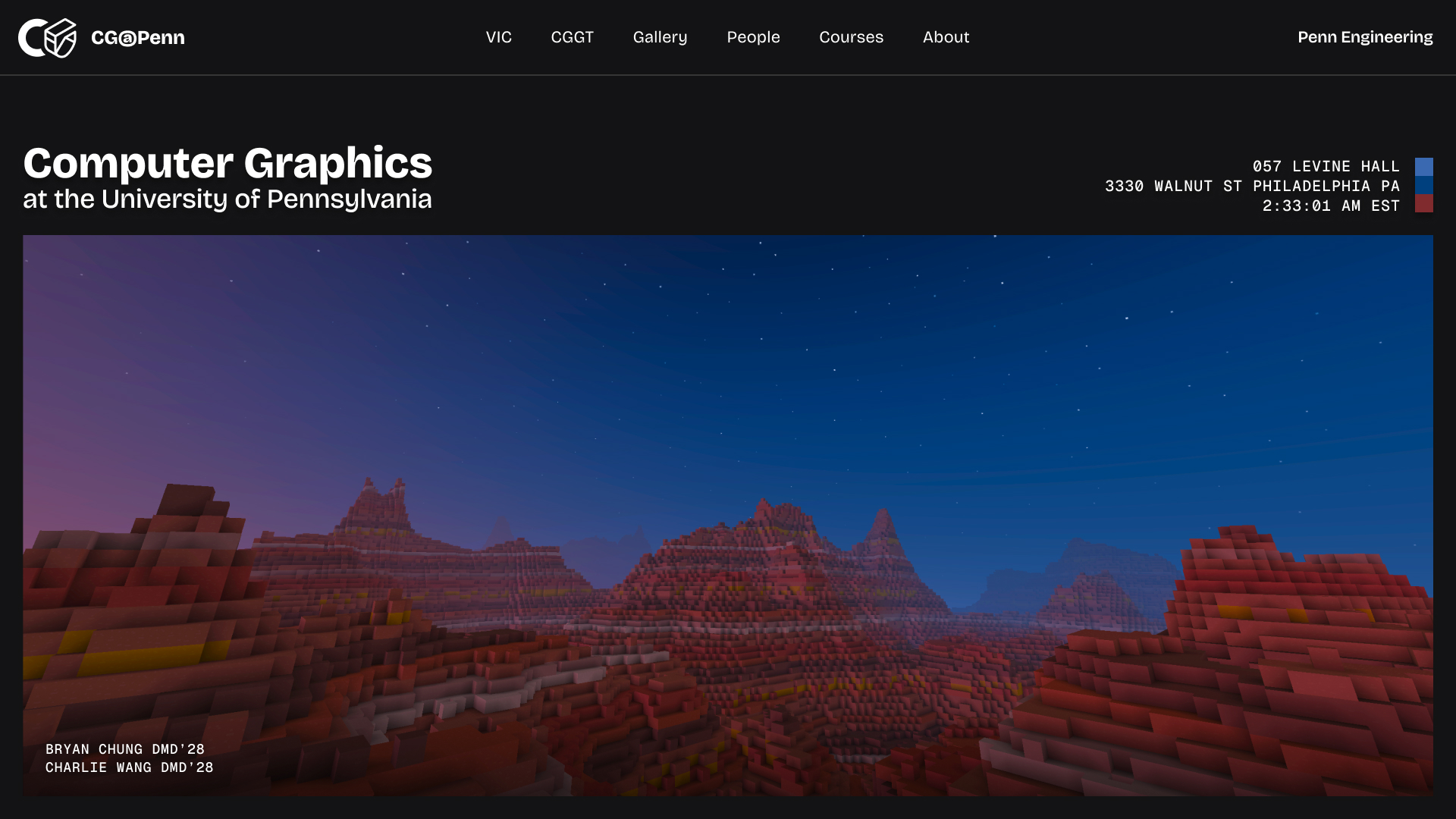
Final refreshed hero page, with rotating student work
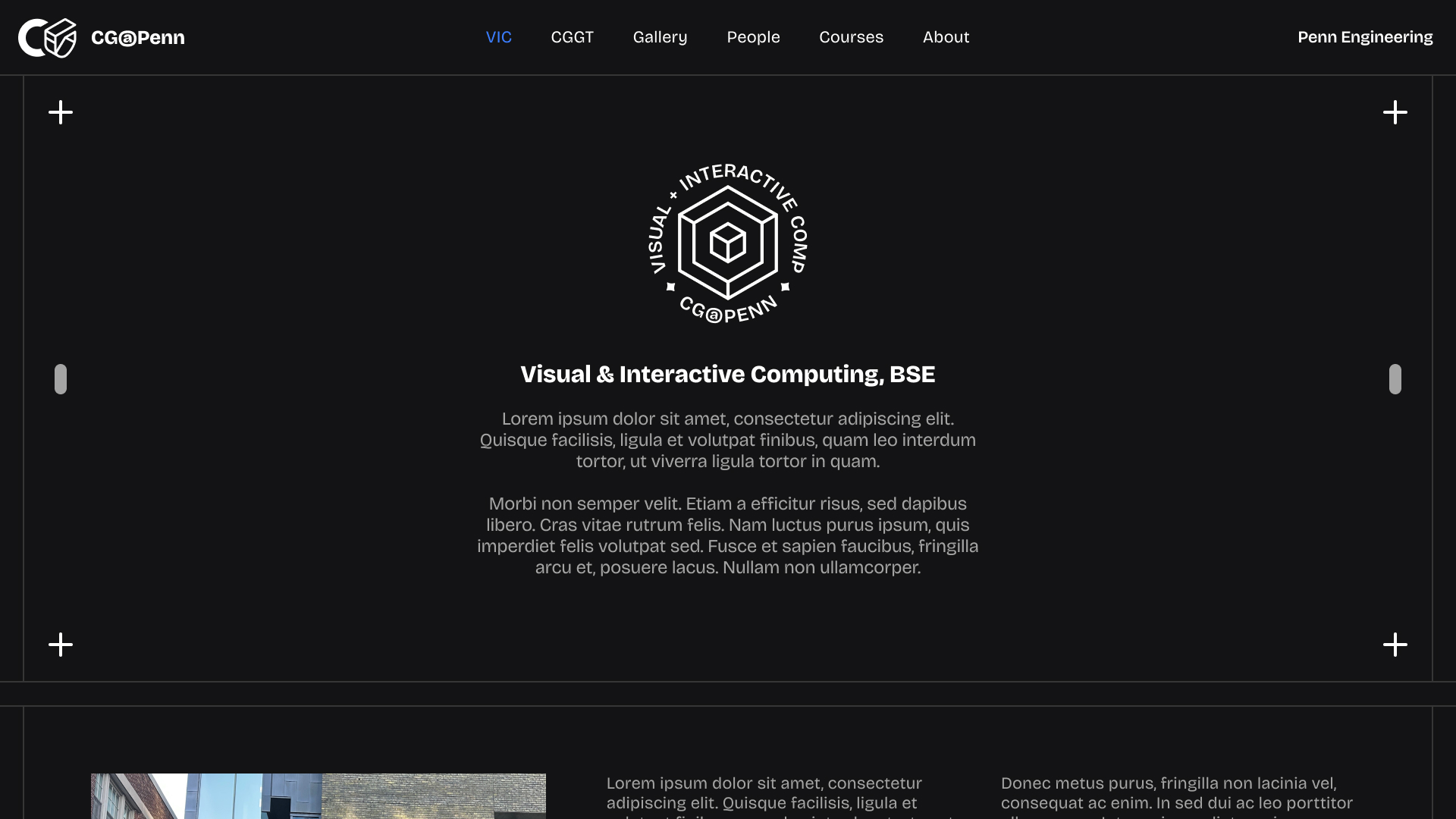
Refreshed program page (click me to expand!)
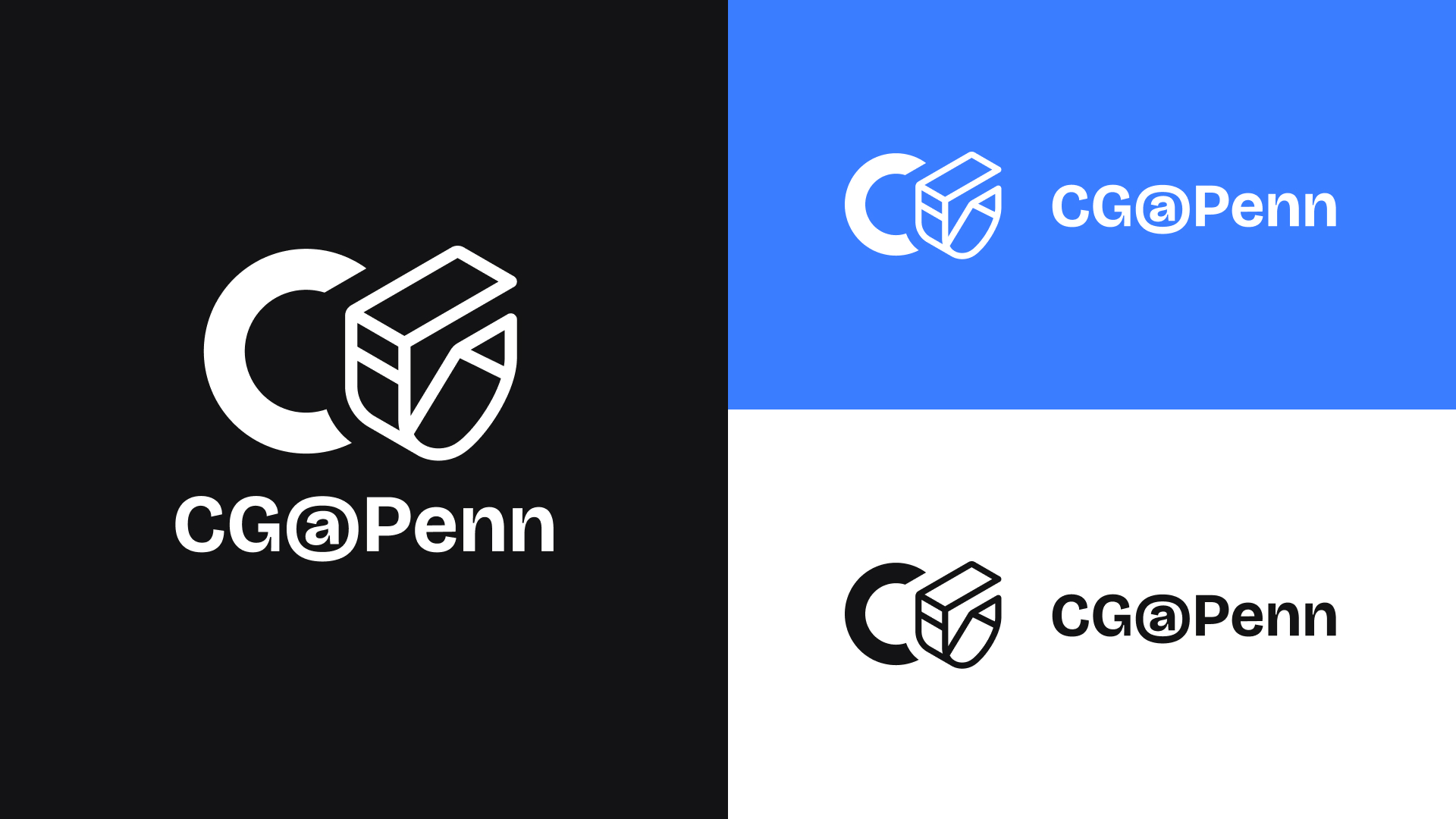
Refreshed logo and type lockups
This project was a ton of fun: for takeaways, I believe I was lucky in that our user base is already segmented into two very clear groups (students/alumni and applicants).
By starting with these clearly defined, I was able to dive deeper into them separately, looking at unique user needs and cross-comparing them.
I also had a personal stake in that I wanted my pride in the program to be reflected well in its presentation, and I'm glad the program's identity was kept in mind throughout the entire iteration process, as well as in my final designs.