Möbelmon - UI Breakdown
UI/UX DESIGN
OCT 2026
OCT 2026
Möbelmon is my solo-developed creature-collector action roguelike for mobile. It's designed to be played with one thumb, on the go, so the UI also needed to be built with this in mind. I wanted to keep the main HUD during gameplay as minimal as possible, to account for the limited screen width of a game oriented in portrait. Contextual menus then appear as necessary, and are usually full-screen for clarity.
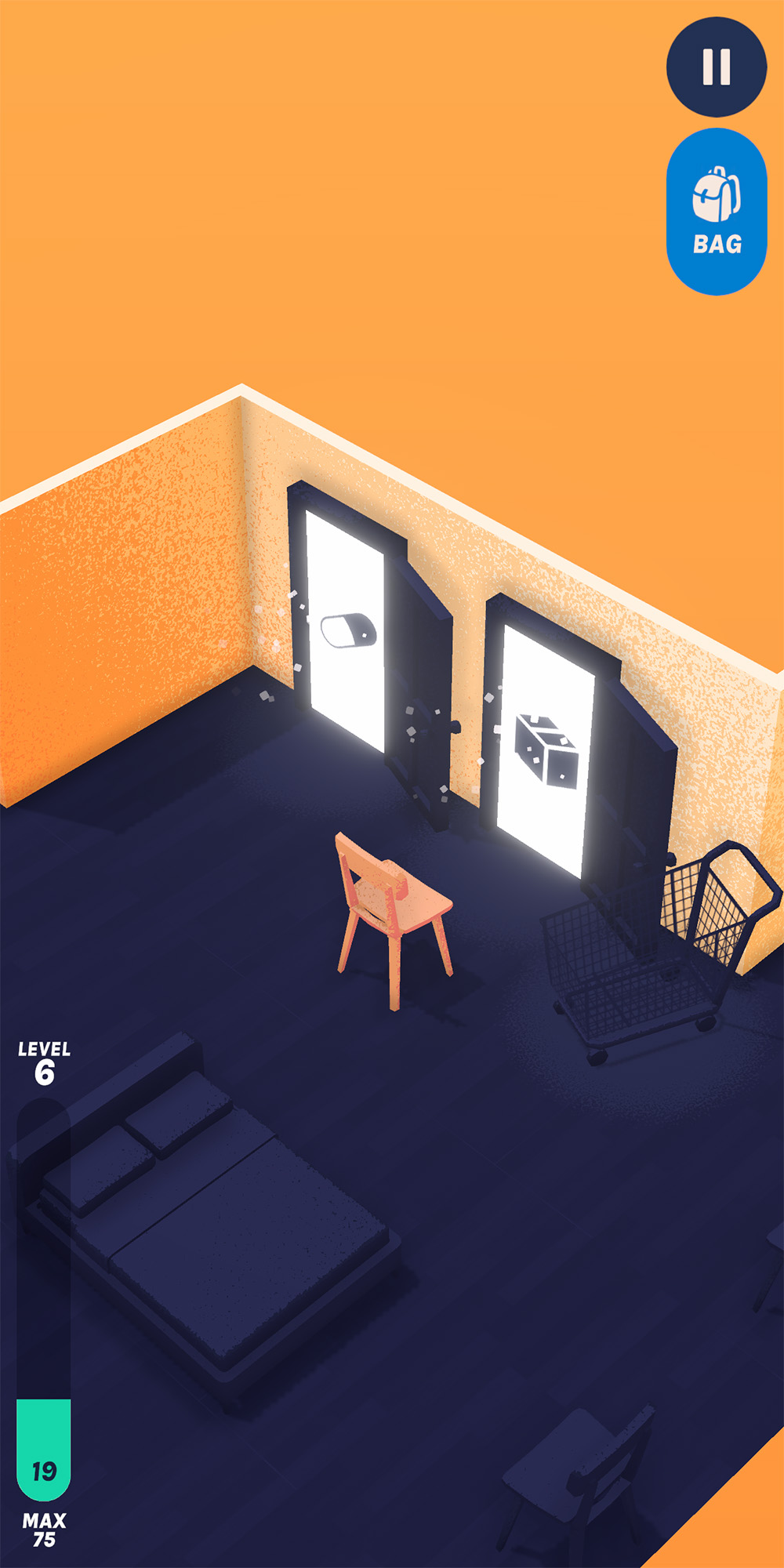
Gameplay HUD
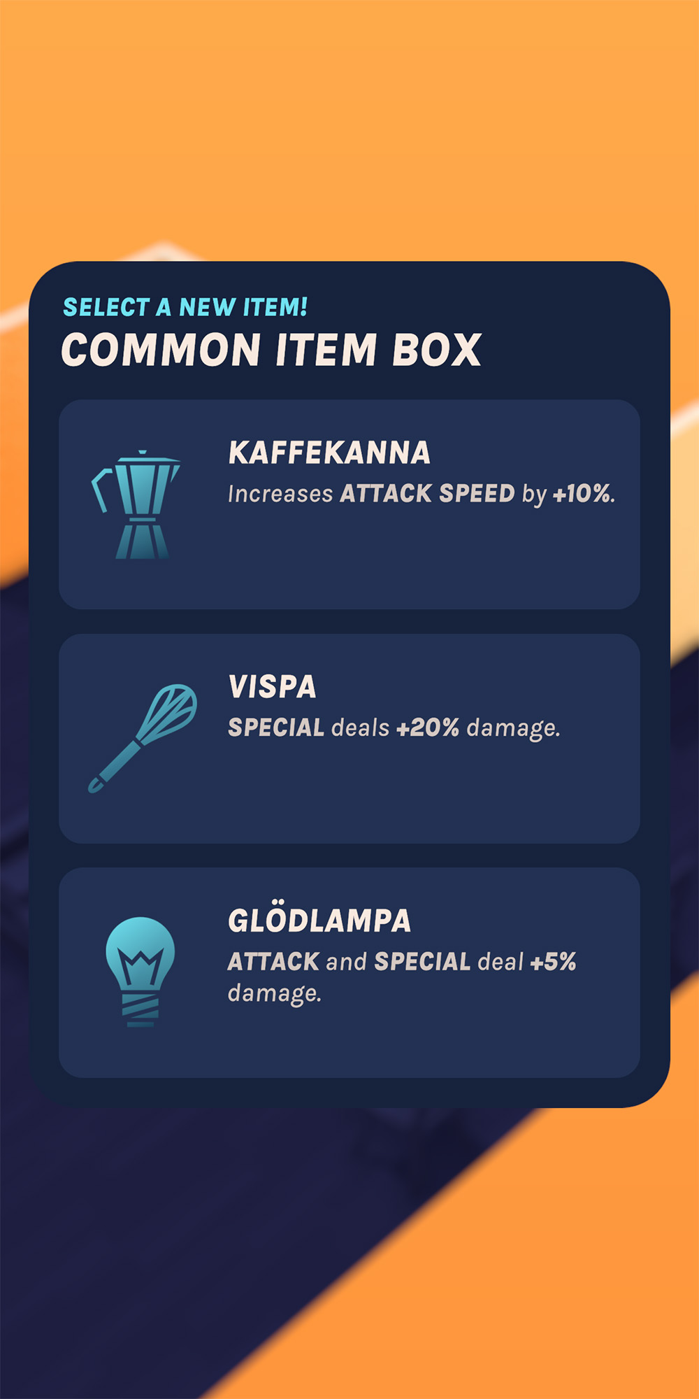
Item selection menu
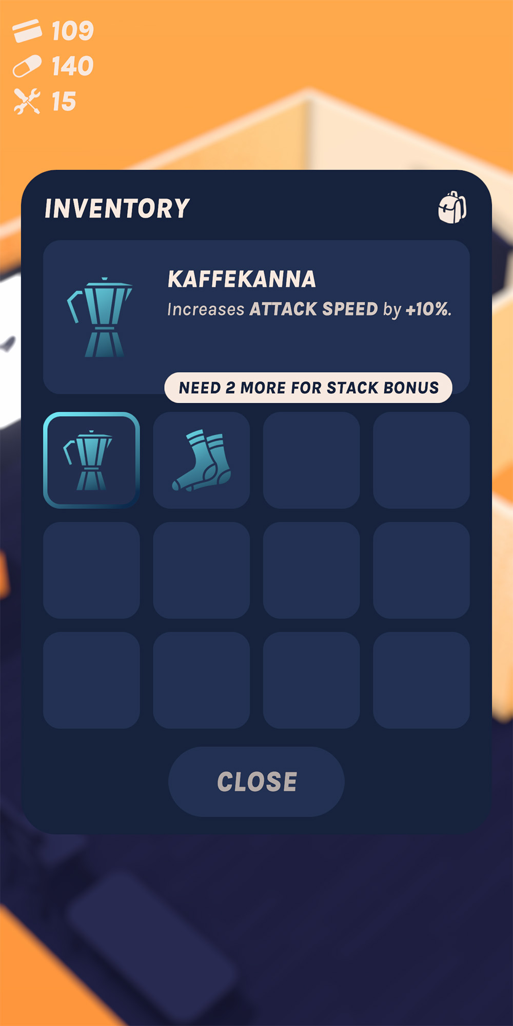
Inventory menu
All submenus follow a shared design, with the "dismiss" button being located at the bottom of each panel to stay in reach. All menus also use a custom modular panel system that handles animations, sounds, and haptics. I went into this project already having some UI experience in Unity, and so my aim was to apply that to a larger game with significantly more complicated systems, while keeping a high level of polish and consistency.
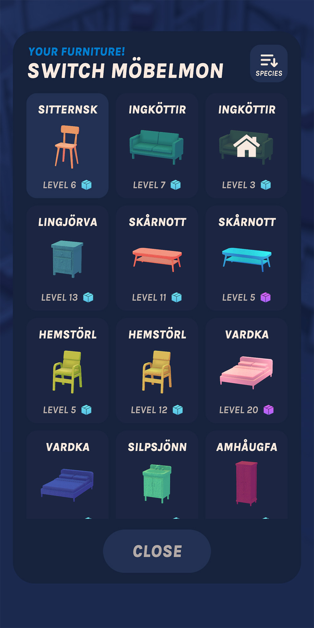
Möbelmon collection
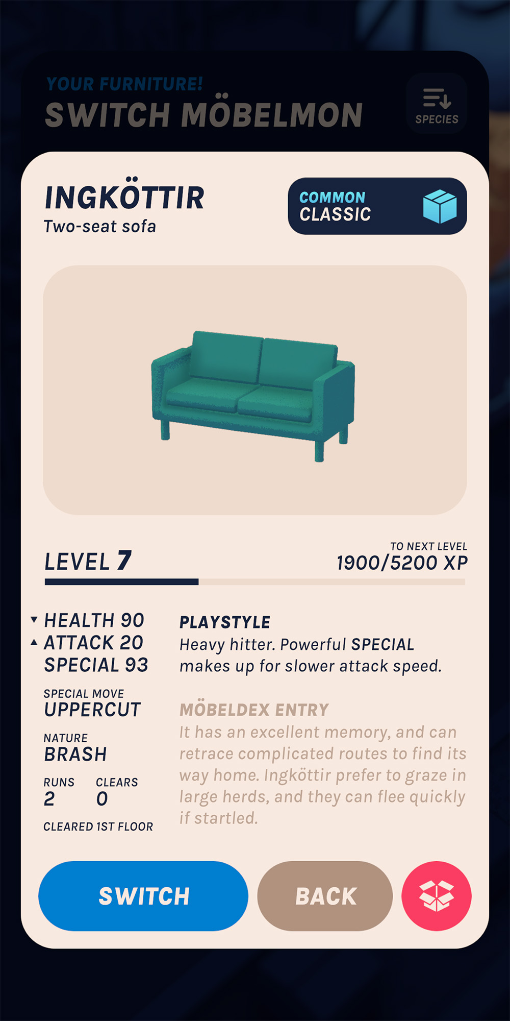
Möbelmon stats
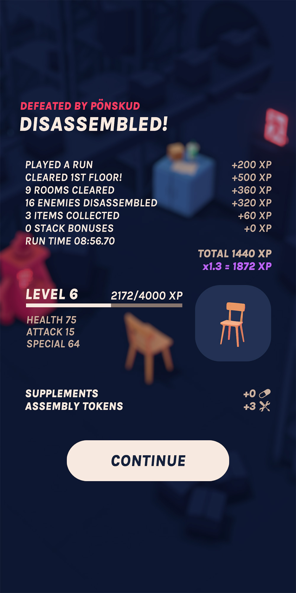
Post-run stats
In combat, the health bar is oriented vertically to keep the bottom half of the screen clear, where the player will be tapping and swiping most often. In playtesting, the bar was covered by left-handed players' thumbs; so, the game features a "lefty mode" as an accessibility option that flips the bar to the right.
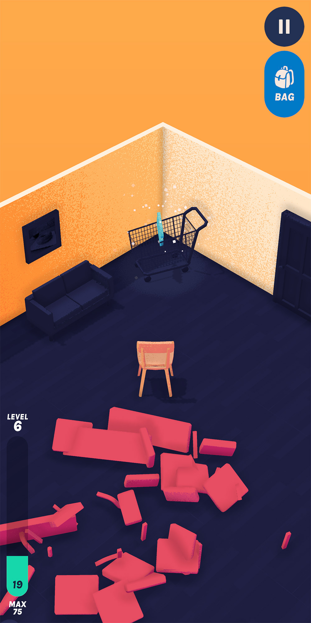
Default HUD
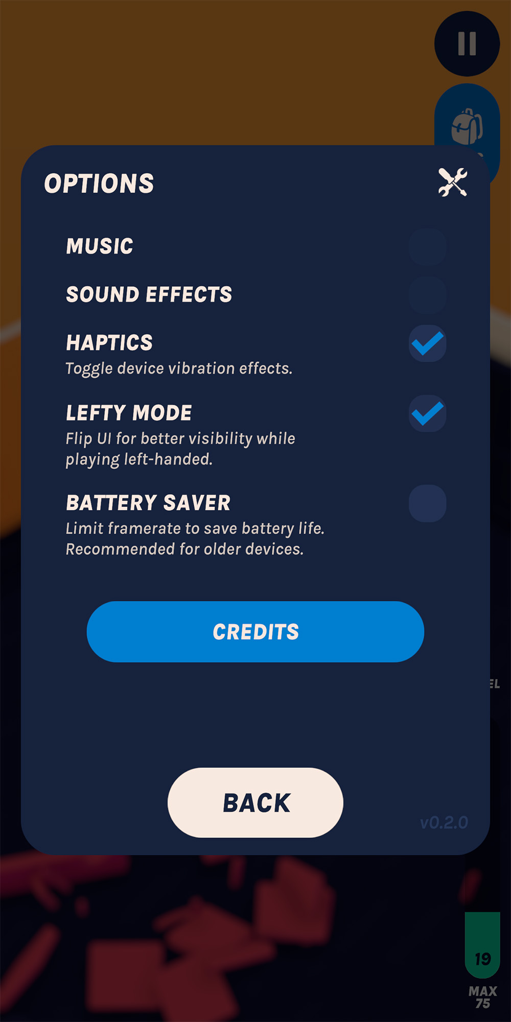
Options menu
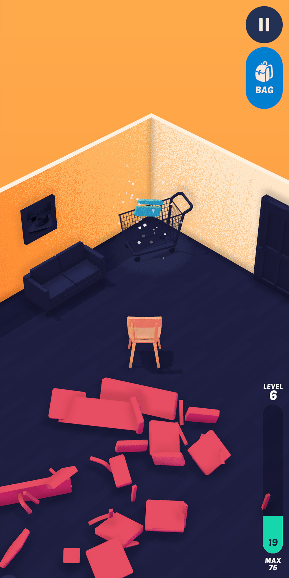
HUD with lefty mode
Möbelmon has several different upgrade systems and menus that the player must mentally keep track of. To keep the distinction between types of upgrades clear, and to ensure the player always knows where to spend a reward they've earned, I wanted each shop and upgrade menu in the game's hub to be visually distinct. Each upgrade menu is represented by a machine in game that the player must interact with, and these are color-coded to match with each UI panel.
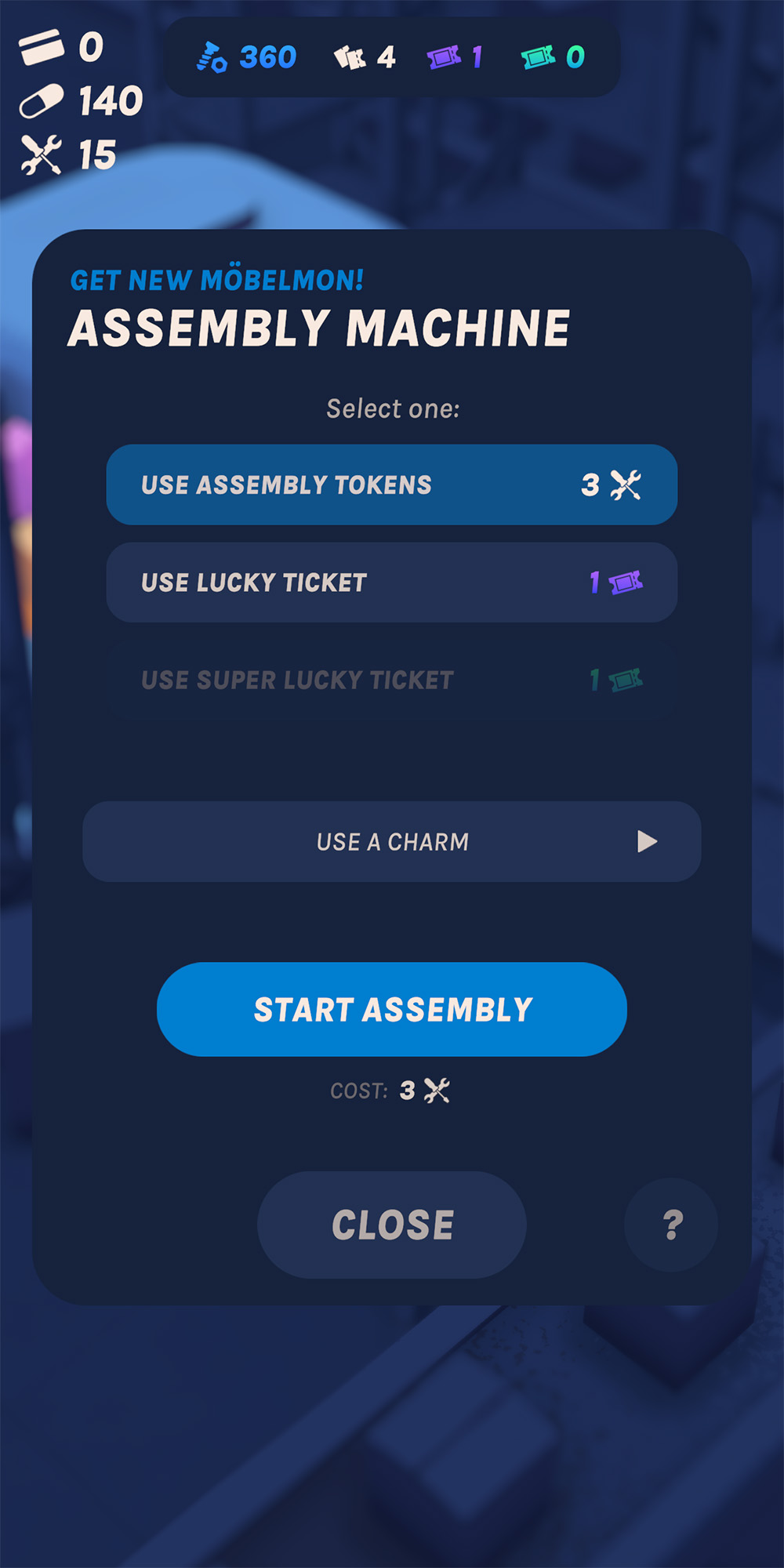
Shop menu
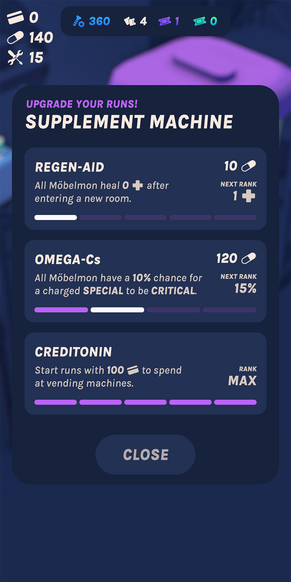
Upgrades menu
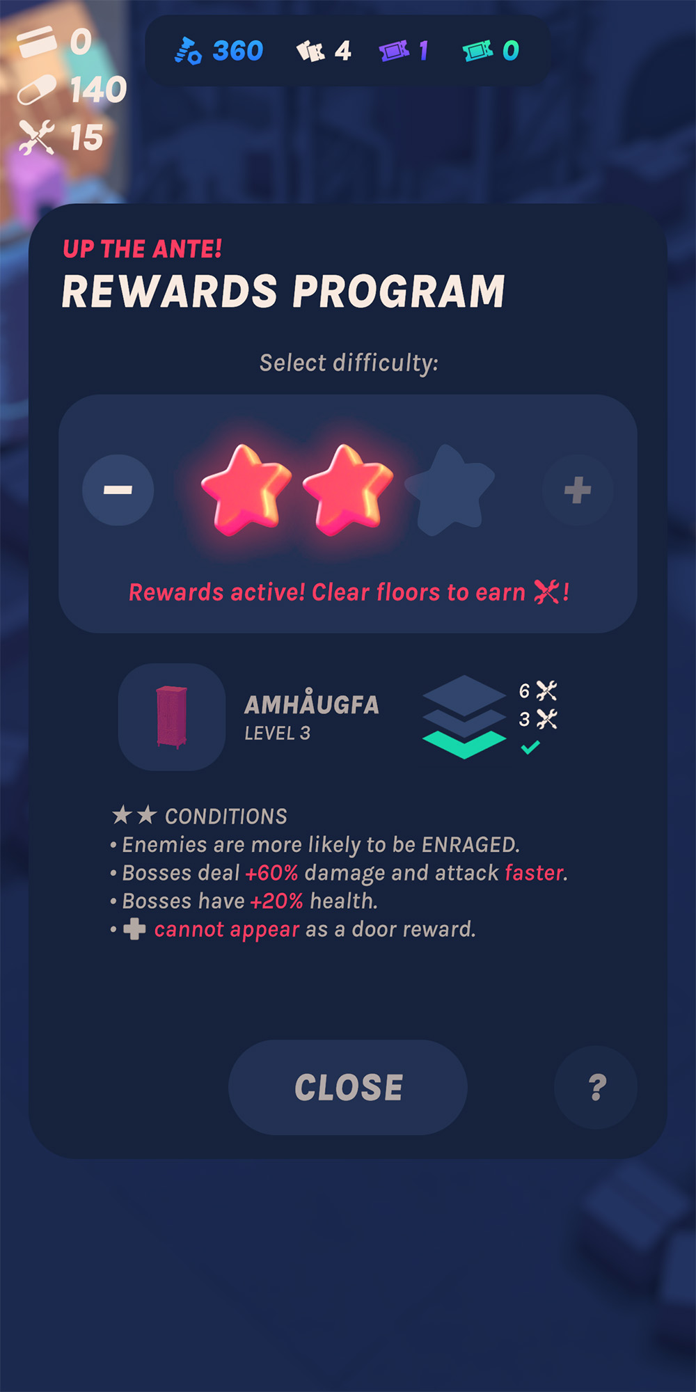
Post-game difficulty menu